Paper Art Finale

Well here it is. It looks terrible on camera and in real life. The end result here is so far off from my original idea. I shouldn't have added as much gold paint as I did. Was not a fan of paper art.
Pop Art Finale
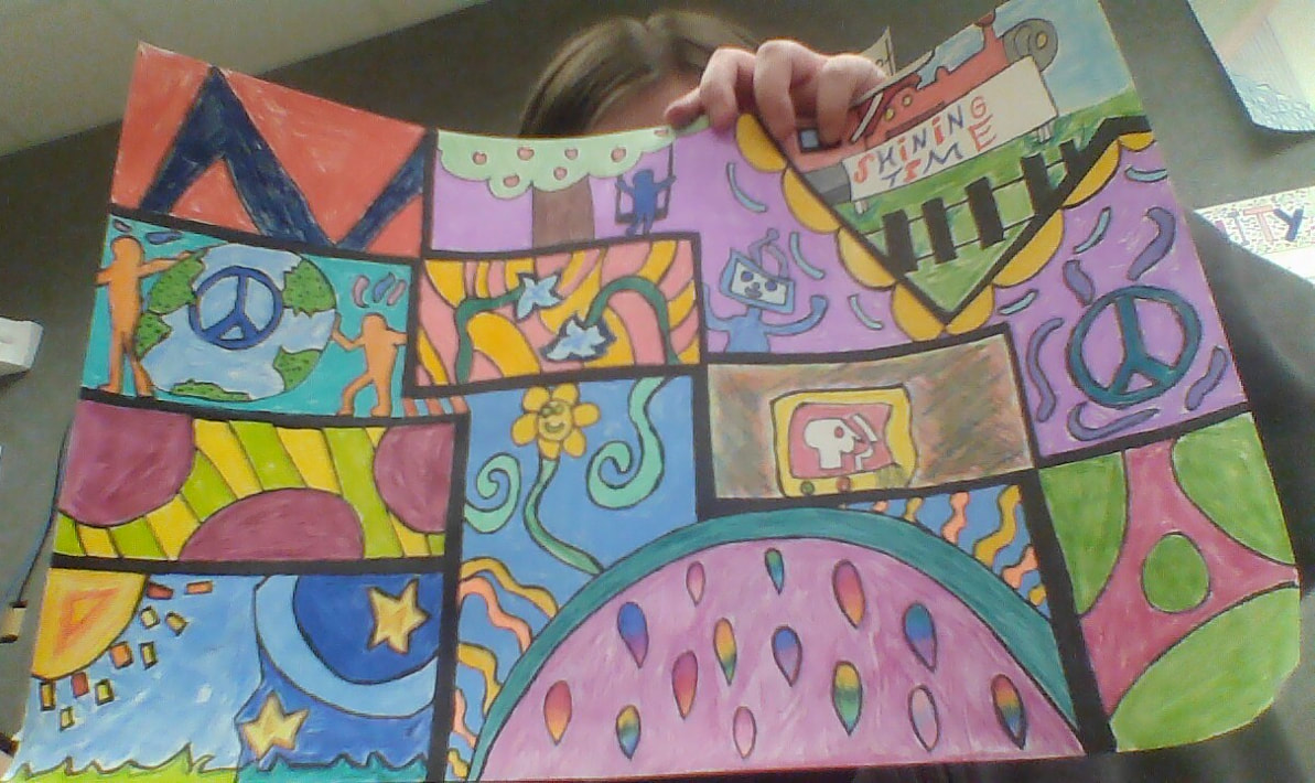
Here is my finished pop art. I tried mimicking Keith Haring´s style. I chose him because he seemed like an interesting person and his art style looked cool. Kind of rushed toward the end. Unlike my other projects though I actually like how this one turned out. I used colored pencil and sharpie to create it. The camera makes it look kind of dull.
Pop Art Progress
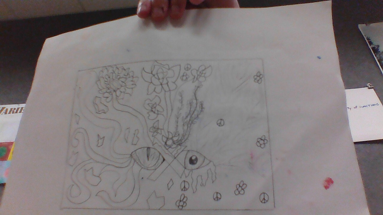
Social Issue Painting Final
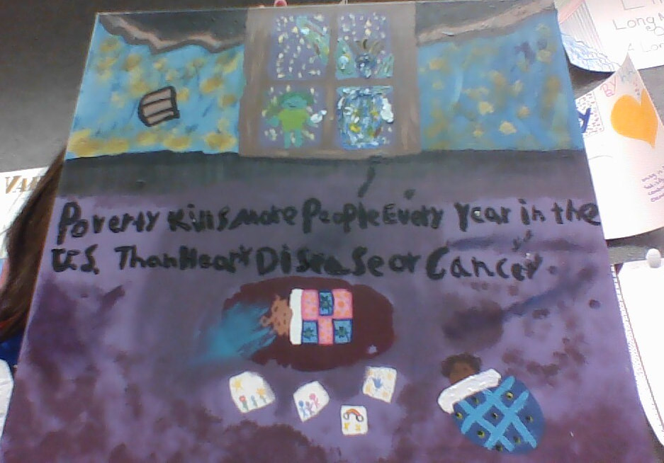
Well here it is. It's a mess, messed up a bit and just kept going. I'm not the best with paint. The social issue I chose was poverty and the words are statistics from an article. The green figure in the window is the ghost of the kid under the blue blanket; standing next to them is an abstract angel. The idea looked better in my head; acrylic paint and paint in general isn't really my thing.
Social Issue Painting Sketch and Progress
Last Project Finale
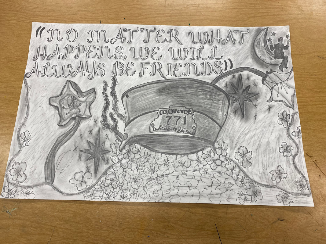
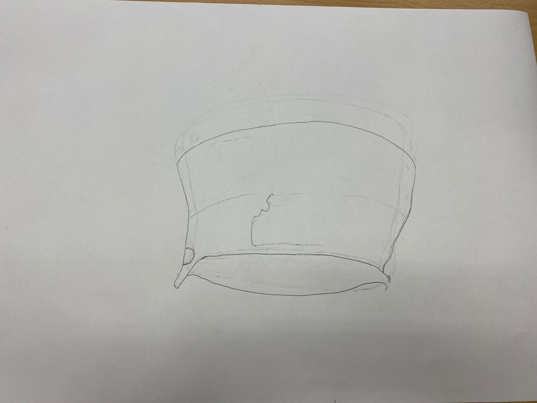
Welp here it is. You can tell where it got messy and rushed. Flowers ended up getting more abstract. I could have done better with shading it´s mostly the same. Yeah it is a bit of a mess. It is piece to honor a show and a character from it. The show along with the character really mean a lot to me. As a kid it was one of my favorite shows;it is just a really nostalgic and a comforting thing to me. The hat is the one the character wears and the quote is one of the last things his character said before leaving the show. The large flowers are supposed to be bluebells and the smaller ones are forget me nots. The top little thing is the one of the show logos except instead of a sign the character is sitting on the moon, moon is supposed to be the light source.
Last Project Progress
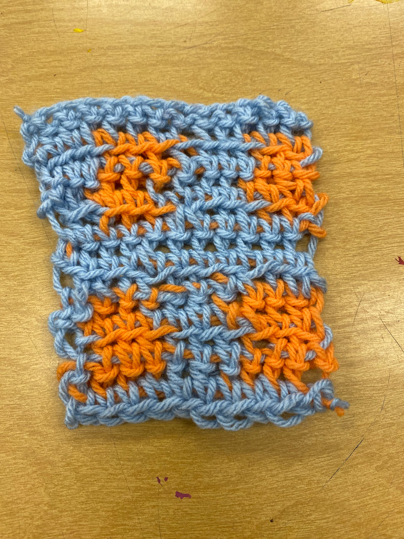
Crochet Tapestry Finale
Well here it is. I liked crochet but it´s a bit confusing. Messed up a bit but kept working on it. I have started making a blanket in the spare time at home. I liked this project it was way better than chalk pastels that´s for sure. It´s fun once you get the hang of it.
Crochet Practice
Georgia O´Keafe Project Finale
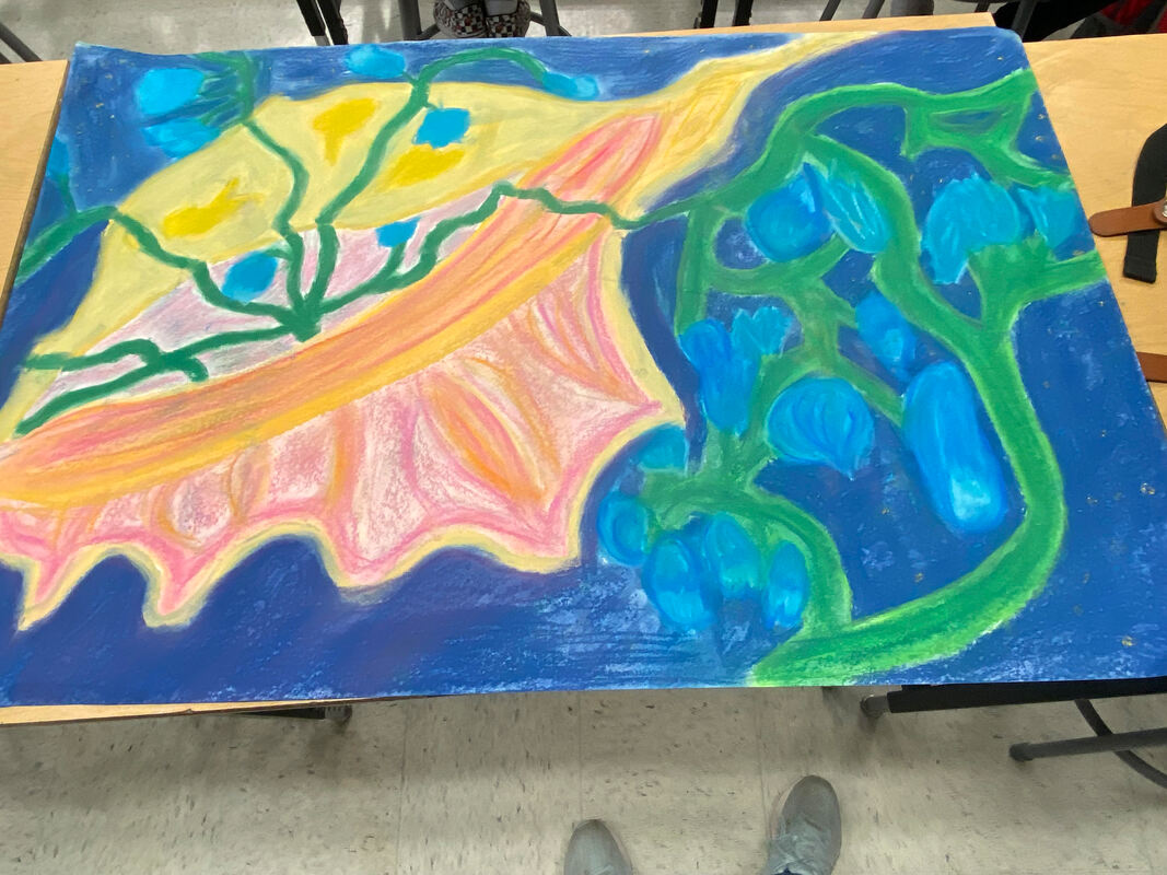
Well here it is, I tried. Doesn´t really look as good as I´d like. It´s a seashell with blue bell flowers coming out of it. I would choose oil pastels over chalk any day after this project. It was fun but chalks a bit messy. The bluebell and seashell idea is a reference to a movie scene; in the movie seashells and bell flowers are used as phones.
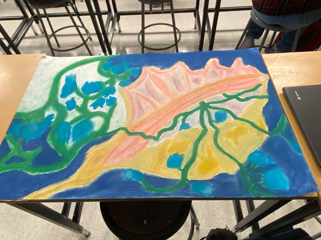
More Progress
Etching Finale
Well here´s the finished piece. Carving some of the design was a bit difficult, especially the little details. Printing was a bit difficult; one time it would print well but smudged the next it would hardly print at all. I decided to go with an abstract design for it. It does have one meaning/thing/person it represents but I like how it can be interpreted in many ways. Over all this project was really fun and I´d like to do etchings again sometime.
Etching State Proofs
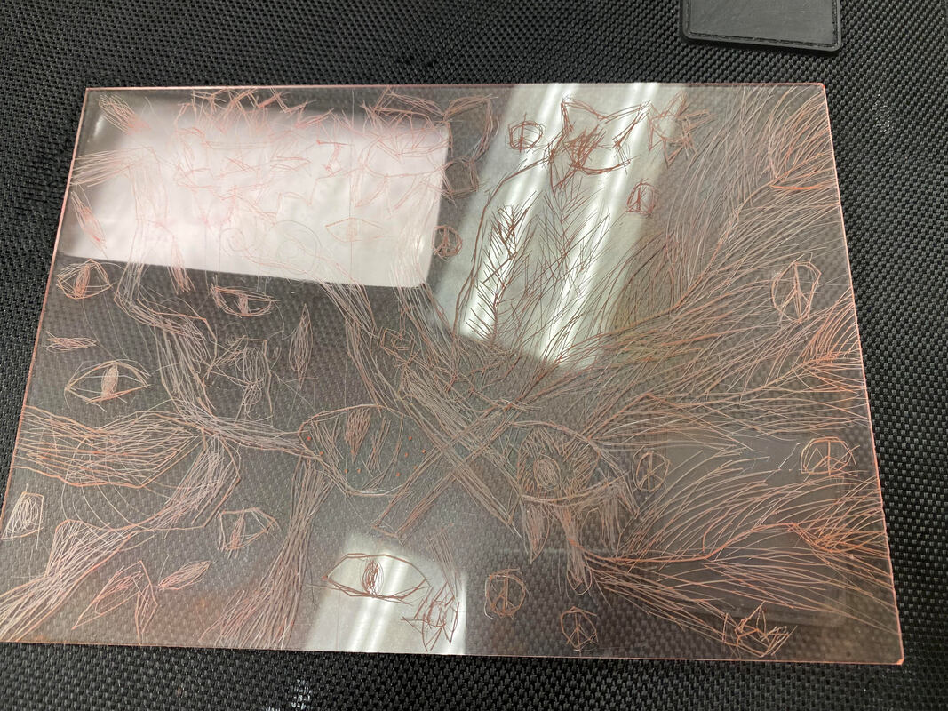
Etching Plate
Etching Sketch
Etching Practice
Fauvism Finale
Well it is a little more cartoonish than realistic. Messed up with a color so I just went with it, ended up with this. I wish the pastels had more of a point would have made this a bit easier. This is Geode the octopus also called soup since he looked like pumpkin soup at one point with the coloring. The little squiggle thing in the top right corner is actually a portal; he is waiting on his friend Kandy the ferret to come through the portal so they can have a halloween themed tea party in the kelp garden. The spilling tea off to the side is supposed to be magic since it looks so strange. So yeah, the drawing has a story. This was really fun to make, I wouldn´t use pastels again though.
Fauvism Progress
Current progress on sketch and the reference image.
